widget.newSegmentedControl()
Type Function Library widget.* Return value SegmentedControlWidget Revision Release 2026.3728 Keywords widget, segment, segmentedControl, control See also SegmentedControlWidget
Overview
Creates a SegmentedControlWidget object.
Gotchas
To conserve texture memory, a SegmentedControlWidget can only be created from an image sheet.
The SegmentedControlWidget object does not support scaling nor changing of the width/height via .width or .height.
The SegmentedControlWidget object does not support changing the anchorX or anchorY properties after creation.
Syntax
widget.newSegmentedControl( options )
This function takes a single argument, options, which is a table that accepts the following parameters:
id (optional)
String. An optional identification to assign to the segmented control. Default is widget_segmentedControl.
x, y (optional)
Numbers. Coordinates for the widget’s x and y center point. These values will be overridden by left and top if those values are defined.
left, top (optional)
Numbers. The left and top position where the widget will be created. If specified, these values override the x and y parameters.
segmentWidth (optional)
Number. The width of each segment in pixels (all segments must be of equal width). Default is 50.
segments (required)
Table. Table of comma-separated strings which defines the total segment count and the label that appears on each. For example:
segments = { "Item 1", "Item 2", "Item 3", "Item 4" }
defaultSegment (optional)
Number. The segment that will be active upon the initial creation. Default is the first segment.
onPress (optional)
Listener. An optional function to be called when a segment is pressed. The callback function does not require testing for event.phase since it only honors began.
Properties
object.segmentLabel
object.segmentNumber
Methods
object:setActiveSegment()
Basic Visual Options
labelSize (optional)
Number. Font size (in pixels) for the segment labels. Default is 12.
labelFont (optional)
String. Font used for the segment labels. Default is native.systemFont.
labelColor (optional)
Table. Table of two RGB+A color settings, one each for the inactive (default) and active (over) states.
labelColor = { default={ 1, 1, 1 }, over={ 0, 0, 0, 0.5 } }
emboss (optional)
Boolean. If set to true, the button label will appear embossed (inset effect).
labelXOffset, labelYOffset (optional)
Numbers. Optional x and y offsets for the segment labels. For example, labelYOffset = -8 will shift the labels 8 pixels up from default.
Visual Customization
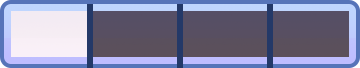
The segmented control widget can be visually customized using 7 frames from an image sheet. As shown in the following example, 6 of these frames can be used to assemble an inactive and active state for each segment. The inactive frames consist of the left cap (red), the middle span (green), and the right cap (yellow). The active frames consist of a left cap (orange), a middle span (blue), and a right cap (purple).
Depending on the width of the segments, the left and right caps remain at the size stated in the image sheet while the middle frames (green or blue) stretch to fill the remaining width of each segment.
Optionally, the segmented control accepts dividers between each segment, shown as the dark blue bar in this example. If defined, dividers overlay the other frames and are distributed evenly across the entire span of the segmented control. If you do not want dividers to appear, simply omit the three associated properties in the widget declaration.
 |
→ |  |
sheet (required)
ImageSheet. The image sheet object for the segmented control.
segmentFrameWidth, segmentFrameHeight (required)
Numbers. The width/height of the main segment frames (end caps and middle spans). All of these frames should share the same width and height.
leftSegmentFrame, leftSegmentSelectedFrame (required)
Numbers. The inactive and active frames for the left end caps.
middleSegmentFrame, middleSegmentSelectedFrame (required)
Numbers. The inactive and active frames for the middle spans.
rightSegmentFrame, rightSegmentSelectedFrame (required)
Numbers. The inactive and active frames for the right end caps.
dividerFrame (optional)
Number. The frame index for the divider frame. Omit this if you don’t want dividers to be shown.
dividerFrameWidth, dividerFrameHeight (optional)
Numbers. The width/height of the divider frame. These are required if dividerFrame is defined.
Examples
Default
local widget = require( "widget" )

-- Listen for segmented control events
local function onSegmentPress( event )
    local target = event.target
    print( "Segment Label is:", target.segmentLabel )
    print( "Segment Number is:", target.segmentNumber )
end

-- Create a default segmented control
local segmentedControl = widget.newSegmentedControl(
    {
        left = 50,
        top = 150,
        segmentWidth = 150,
        segments = { "Item 1", "Item 2", "Item 3", "Item 4" },
        defaultSegment = 2,
        onPress = onSegmentPress
    }
)
Image Sheet
local widget = require( "widget" )

-- Listen for segmented control events
local function onSegmentPress( event )
    local target = event.target
    print( "Segment Label is:", target.segmentLabel )
    print( "Segment Number is:", target.segmentNumber )
end

-- Image sheet options and declaration
-- For testing, you may copy/save the image under "Visual Customization" above
local options = {
    frames =
    {
        { x=0, y=0, width=40, height=68 },
        { x=40, y=0, width=40, height=68 },
        { x=80, y=0, width=40, height=68 },
        { x=122, y=0, width=40, height=68 },
        { x=162, y=0, width=40, height=68 },
        { x=202, y=0, width=40, height=68 },
        { x=245, y=0, width=4, height=68 }
    },
    sheetContentWidth = 250,
    sheetContentHeight = 68
}
local segmentSheet = graphics.newImageSheet( "widget-segmented-control.png", options )

-- Create a custom segmented control
local segmentedControl = widget.newSegmentedControl(
    {
        left = 50,
        top = 150,

        sheet = segmentSheet,
        leftSegmentFrame = 1,
        middleSegmentFrame = 2,
        rightSegmentFrame = 3,
        leftSegmentSelectedFrame = 4,
        middleSegmentSelectedFrame = 5,
        rightSegmentSelectedFrame = 6,
        segmentFrameWidth = 40,
        segmentFrameHeight = 68,

        dividerFrame = 7,
        dividerFrameWidth = 4,
        dividerFrameHeight = 68,

        segmentWidth = 90,
        segments = { "Item 1", "Item 2", "Item 3", "Item 4" },
        defaultSegment = 1,
        labelColor = { default={1,1,1,1}, over={1,0.3,0.8,1} },
        onPress = onSegmentPress
    }
)