widget.newSlider()
Type Function Library widget.* Return value SliderWidget Revision Release 2026.3728 Keywords widget, slider, sliding control See also SliderWidget
Overview
Creates a SliderWidget object.
Gotchas
To conserve texture memory, a SliderWidget object can only be created from an image sheet.
SliderWidget objects do not support scaling nor changing the width/height via .width or .height.
Syntax
widget.newSlider( options )
This function takes a single argument, options, which is a table that accepts the following parameters:
id (optional)
String. An optional identification to assign to the slider. Default is "widget_slider".
x, y (optional)
Numbers. Coordinates for the widget’s x and y center point. These values will be overridden by left and top if those values are defined.
left, top (optional)
Numbers. The left and top position where the widget will be created. If specified, these values override the x and y parameters.
orientation (optional)
String. The orientation of the slider, either "horizontal" or "vertical". Default is "horizontal".
width, height (required)
Numbers. The width or height of the slider, depending on the orientation setting (width for horizontal or height for vertical).
value (optional)
Number. Represents the starting value of the slider, as a percentage. Default is 50, meaning that the slider handle will begin at 50%.
listener (optional)
Listener. The function which is called to handle slider interaction events. In this listener function, event.phase returns the expected touch interaction phases of "began", "moved", or "ended". In addition, you can read the new value of the slider with event.value.
Properties
object.value
Methods
object:setValue()
Visual Customization
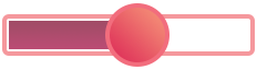
The slider widget can be visually customized using an image sheet. As shown in the following example, 5 frames can be used to assemble an outer border and an inner fill bar. The outer border consists of the left cap (red), the middle span (green), and the right cap (yellow). The inner fill region (orange) will stretch to span the current slider fill percentage. All of the outer border frames and the inner fill frame should share the same width and height.
The handle frame can be sized differently than the other frames. Note that all slider widgets have a limit to which the handle can be dragged in either direction. In regards to visual customization, the handle will stop when its center axis reaches either edge of the middle span section. Thus, for a horizontal slider, the handle will stop when its center axis reaches the left or right edge of the
 |
→ |  |
sheet (required)
ImageSheet. The image sheet object for the slider.
Horizontal Slider
leftFrame (required)
Number. The frame index for the border left cap.
middleFrame (required)
Number. The frame index for the border middle span.
rightFrame (required)
Number. The frame index for the border right cap.
fillFrame (required)
Number. The frame index for the middle fill span.
frameWidth, frameHeight (required)
Numbers. The width/height of the border frames and middle fill span. All of these frames should share the same width and height.
handleFrame (required)
Number. The frame index for the handle element.
handleWidth, handleHeight (required)
Numbers. The width/height of the handle element frame.
Vertical Slider
topFrame (required)
Number. The frame index for the border top cap.
middleVerticalFrame (required)
Number. The frame index for the border middle span.
bottomFrame (required)
Number. The frame index for the border bottom cap.
fillVerticalFrame (required)
Number. The frame index for the middle fill span.
frameWidth, frameHeight (required)
Numbers. The width/height of the border frames and middle fill span. All of these frames should share the same width and height.
handleFrame (required)
Number. The frame index for the handle element.
handleWidth, handleHeight (required)
Numbers. The width/height of the handle element frame.
Examples
Horizontal
local widget = require( "widget" )

-- Slider listener
local function sliderListener( event )
    print( "Slider at " .. event.value .. "%" )
end

-- Create the widget
local slider = widget.newSlider(
    {
        x = display.contentCenterX,
        y = display.contentCenterY,
        width = 400,
        value = 10,  -- Start slider at 10% (optional)
        listener = sliderListener
    }
)
Vertical
local widget = require( "widget" )

-- Slider listener
local function sliderListener( event )
    print( "Slider at " .. event.value .. "%" )
end

-- Create the widget
local slider = widget.newSlider(
    {
        x = display.contentCenterX,
        y = display.contentCenterY,
        orientation = "vertical",
        height = 200,
        value = 10,  -- Start slider at 10% (optional)
        listener = sliderListener
    }
)
Image Sheet
local widget = require( "widget" )

-- Slider listener
local function sliderListener( event )
    print( "Slider at " .. event.value .. "%" )
end

-- Image sheet options and declaration
-- For testing, you may copy/save the image under "Visual Customization" above
local options = {
    frames = {
        { x=0, y=0, width=36, height=64 },
        { x=40, y=0, width=36, height=64 },
        { x=80, y=0, width=36, height=64 },
        { x=124, y=0, width=36, height=64 },
        { x=168, y=0, width=64, height=64 }
    },
    sheetContentWidth = 232,
    sheetContentHeight = 64
}
local sliderSheet = graphics.newImageSheet( "widget-slider.png", options )

-- Create the widget
local slider = widget.newSlider(
    {
        sheet = sliderSheet,
        leftFrame = 1,
        middleFrame = 2,
        rightFrame = 3,
        fillFrame = 4,
        frameWidth = 36,
        frameHeight = 64,
        handleFrame = 5,
        handleWidth = 64,
        handleHeight = 64,
        x = display.contentCenterX,
        y = display.contentCenterY,
        orientation = "horizontal",
        width = 300,
        listener = sliderListener
    }
)