widget.newTabBar()
Type Function Library widget.* Return value TabBarWidget Revision Release 2026.3728 Keywords widget, tab bar, tabs, tab buttons See also TabBarWidget
Overview
Creates a TabBarWidget object.
Gotchas
TabBarWidget objects do not support scaling nor changing the width/height via .width or .height.
TabBarWidget objects do not support changing the anchorX or anchorY properties after creation.
Syntax
widget.newTabBar( options )
This function takes a single argument, options, which is a table that accepts the following parameters:
id (optional)
String. An optional identification to assign to the tab bar. Default is widget_tabBar.
x, y (optional)
Numbers. Coordinates for the widget’s x and y center point. These values will be overridden by left and top if those values are defined.
left, top (optional)
Numbers. The left and top position where the widget will be created. If specified, these values override the x and y parameters.
width, height (optional)
Numbers. The width and height of the tab bar, in pixels. The default height is 52.
Methods
object:setSelected()
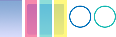
Visual Customization — Image Files
TabBarWidget objects can be visually customized using individual image files. These include:
- an optional background image that spans the bar width and height (left-side gradient in the diagram)
- three optional, equally-sized image files for tab highlight overlays (red, green, and yellow in the diagram)
- two optional image files for each specified tab button which overlays the bar (ring images in the diagram)
 |
→ |  |
baseDir (optional)
Constant. The base directory where your custom images are located. Default is your project folder (system.ResourceDirectory).
backgroundFile (optional)
String. The background image file for the tab bar. This may be designed to be flexible in width/height.
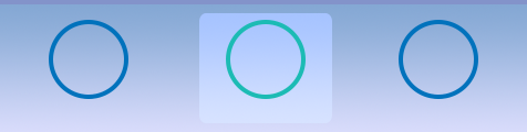
Highlight Overlay
You may configure an optional highlight overlay which will be placed in front of the background but behind the optional button image. Highlight overlays are composed of a left, middle, and right image file, each of which should be designed equal in size. However, if the tab is wider than the collective width of these three image files, the overlay will stretch to fit the width of the tab. In this case, the left and right edge images will remain at their original size, but the middle section will stretch to fill the distance between.
tabSelectedLeftFile (required)
String. The left edge image file for the tab highlight overlay.
tabSelectedMiddleFile (required)
String. The middle image file for the tab highlight overlay. This should be designed to be flexible in width.
tabSelectedRightFile (required)
String. The right edge image file for the tab highlight overlay.
tabSelectedFrameWidth, tabSelectedFrameHeight (required)
Numbers. The width and height of each highlight overlay image. All three sections should be designed equal in size.
Visual Customization — Image Sheet
TabBarWidget objects can be visually customized using frames from an image sheet. These include:
- an optional background frame that spans the bar width and height (left-side gradient in the diagram)
- three optional, equally-sized image frames for tab highlight overlays (red, green, and yellow in the diagram)
- two optional image frames for each specified tab button which overlays the bar (ring images in the diagram)
 |
→ | |
sheet (required)
ImageSheet. The image sheet object for the tab bar.
backgroundFrame (optional)
String. The background image frame for the tab bar. This may be designed to be flexible in width/height.
backgroundFrameWidth, backgroundFrameHeight (required)
Numbers. The width and height of the background frame.
Highlight Overlay
You may configure an optional highlight overlay which will be placed in front of the background but behind the optional button image. Highlight overlays are composed of a left, middle, and right image frame, each of which should be designed equal in size. However, if the tab is wider than the collective width of these three image frames, the overlay will stretch to fit the width of the tab. In this case, the left and right edge frames will remain at their original size, but the middle section will stretch to fill the distance between.
tabSelectedLeftFrame (required)
String. The left edge image frame for the tab highlight overlay.
tabSelectedMiddleFrame (required)
String. The middle image frame for the tab highlight overlay. This should be designed to be flexible in width.
tabSelectedRightFrame (required)
String. The right edge image frame for the tab highlight overlay.
tabSelectedFrameWidth, tabSelectedFrameHeight (required)
Numbers. The width and height of each highlight overlay frame. All three sections should be designed equal in size.
Examples
Default
local widget = require( "widget" )

-- Function to handle button events
local function handleTabBarEvent( event )
    print( event.target.id )  -- Reference to button's 'id' parameter
end

-- Configure the tab buttons to appear within the bar
local tabButtons = {
    {
        label = "Tab1",
        id = "tab1",
        selected = true,
        onPress = handleTabBarEvent
    },
    {
        label = "Tab2",
        id = "tab2",
        onPress = handleTabBarEvent
    },
    {
        label = "Tab3",
        id = "tab3",
        onPress = handleTabBarEvent
    }
}

-- Create the widget
local tabBar = widget.newTabBar(
    {
        top = display.contentHeight-120,
        width = display.contentWidth,
        buttons = tabButtons
    }
)
Image Files
local widget = require( "widget" )

-- Function to handle button events
local function handleTabBarEvent( event )
    print( event.target.id )  -- Reference to button's 'id' parameter
end

-- Configure the tab buttons to appear within the bar
local tabButtons = {
    {
        width = 72,
        height = 120,
        defaultFile = "tabBarIconDef.png",
        overFile = "tabBarIconOver.png",
        label = "Tab1",
        id = "tab1",
        selected = true,
        size = 16,
        labelYOffset = -8,
        onPress = handleTabBarEvent
    },
    {
        width = 72,
        height = 120,
        defaultFile = "tabBarIconDef.png",
        overFile = "tabBarIconOver.png",
        label = "Tab2",
        id = "tab2",
        size = 16,
        labelYOffset = -8,
        onPress = handleTabBarEvent
    },
    {
        width = 72,
        height = 120,
        defaultFile = "tabBarIconDef.png",
        overFile = "tabBarIconOver.png",
        label = "Tab3",
        id = "tab3",
        size = 16,
        labelYOffset = -8,
        onPress = handleTabBarEvent
    }
}

-- Create the widget
local tabBar = widget.newTabBar(
    {
        left = 0,
        top = display.contentHeight-120,
        width = 580,
        height = 120,
        backgroundFile = "tabBarBack.png",
        tabSelectedLeftFile = "tabBarSelL.png",
        tabSelectedRightFile = "tabBarSelR.png",
        tabSelectedMiddleFile = "tabBarSelM.png",
        tabSelectedFrameWidth = 40,
        tabSelectedFrameHeight = 120,
        buttons = tabButtons
    }
)
Image Sheet
local widget = require( "widget" )

-- Function to handle button events
local function handleTabBarEvent( event )
    print( event.target.id )  -- Reference to button's 'id' parameter
end

-- Image sheet options and declaration
-- For testing, you may copy/save the image under "Visual Customization: Image Sheet" above
local options = {
    frames =
    {
        { x=4, y=0, width=24, height=120 },
        { x=32, y=0, width=40, height=120 },
        { x=72, y=0, width=40, height=120 },
        { x=112, y=0, width=40, height=120 },
        { x=152, y=0, width=72, height=120 },
        { x=224, y=0, width=72, height=120 }
    },
    sheetContentWidth = 296,
    sheetContentHeight = 120
}
local tabBarSheet = graphics.newImageSheet( "widget-tabbar-sheet.png", options )

-- Configure the tab buttons to appear within the bar
local tabButtons = {
    {
        defaultFrame = 5,
        overFrame = 6,
        label = "Tab1",
        id = "tab1",
        selected = true,
        size = 16,
        labelYOffset = -8,
        onPress = handleTabBarEvent
    },
    {
        defaultFrame = 5,
        overFrame = 6,
        label = "Tab2",
        id = "tab2",
        size = 16,
        labelYOffset = -8,
        onPress = handleTabBarEvent
    },
    {
        defaultFrame = 5,
        overFrame = 6,
        label = "Tab3",
        id = "tab3",
        size = 16,
        labelYOffset = -8,
        onPress = handleTabBarEvent
    }
}

local tabBar = widget.newTabBar(
    {
        sheet = tabBarSheet,
        left = 0,
        top = display.contentHeight-120,
        width = 580,
        height = 120,
        backgroundFrame = 1,
        tabSelectedLeftFrame = 2,
        tabSelectedMiddleFrame = 3,
        tabSelectedRightFrame = 4,
        tabSelectedFrameWidth = 40,
        tabSelectedFrameHeight = 120,
        buttons = tabButtons
    }
)