widget.newPickerWheel()
Type Function Library widget.* Return value PickerWheelWidget Revision Release 2026.3728 Keywords widget, picker, pickerWheel See also PickerWheelWidget
Overview
Creates a PickerWheelWidget object.
Gotchas
To conserve texture memory, a PickerWheelWidget object can only be visually customized using an image sheet.
PickerWheelWidget objects do not support scaling nor changing the width/height via .width or .height. If you want to implement a
custom-size picker wheel to suit your user interface, please see Resizable Construction below.
Syntax
widget.newPickerWheel( options )
This function takes a single argument, options, which is a table that accepts the following parameters:
id (optional)
String. An optional identification to assign to the picker wheel. Default is widget_pickerWheel.
x, y (optional)
Numbers. Coordinates for the widget’s x and y center point. These values will be overridden by left and top if those values are defined.
left, top (optional)
Numbers. The left and top position where the widget will be created. If specified, these values override the x and y parameters.
columns (required)
Table. A table which contains a sub-table for each individual column within the picker wheel. See Configuring Columns below.
style (optional)
String. Indicates the picker wheel construction style. If set to "resizable", construction will adhere to the design outlined in Resizable Construction below. If omitted, construction will adhere to a fixed size of 320×222.
onValueSelected (optional)
Listener. Optional listener function which is triggered when the user selects an item in the picker wheel, or upon calling object:selectValue().
Methods
object:getValues()
object:selectValue()
Configuring Columns
Columns within the picker wheel are defined by an ordered series of columns table. These columns will be added to the picker wheel from left to right, in the order you define them.
Each sub-table within the columns table accepts the following parameters:
labels (required)
Table. A table of ordered values that represent the label for each row in the column. For example:
labels = { "Monday", "Tuesday", "Wednesday", "Thursday", "Friday", "Saturday", "Sunday" }
width (optional)
Number. By default, columns are split evenly between the picker wheel’s viewable area, but a column’s width can be defined via the width property — this allows you to resize each column width to better fit its defined labels.
align (optional)
String. Specifies the alignment of the text labels within the column. Acceptable values are "left", "center", or "right". Default is "center".
labelPadding (optional)
Number. An optional number of pixels to pad/offset the picker column labels. If align is set to "left", padding will occur from the left edge of the column; if align is set to "right", padding will occur from the right edge. 6.
startIndex (required)
Number. The column’s
Basic Visual Options
font (optional)
String. Font used for the picker wheel column entries. Default is native.systemFont.
fontSize (optional)
Number. Font size (in pixels) for the picker wheel column entries. Default is 22.
fontColor (optional)
Table. Table specifying an RGB+A color for the font color of the “unselected” picker wheel labels.
fontColor = { 0.2, 0.2, 0.2 }
fontColorSelected (optional)
Table. Table specifying an RGB+A color for the font color of the “selected” picker wheel labels.
fontColorSelected = { 1, 0, 0 }
columnColor (optional)
Table. Table specifying an RGB+A color setting for the background color of the picker wheel columns.
columnColor = { 0.8, 0.8, 0.8 }
Resizable Construction
Resizable picker wheels can be constructed at a size which fits your user interface — simply set style to "resizable" in the widget constructor parameters and include these additional required parameters:
The border/overlay frame construction is optional, but if you want to include a border, you must specify all of the frame indices necessary to construct it (eight in total).
Resizable picker wheels are not compatible with legacy widget themes. If you’re implementing a resizable picker wheel, you should explicitly set a
non-legacy theme via widget.setTheme(), such as"widget_theme_android_holo_dark","widget_theme_android_holo_light", or"widget_theme_ios7".
width (required)
Number. An integer which sets the overall width of the picker wheel.
rowHeight (required)
Number. An integer which sets the height of each row in the picker wheel’s columns. Because picker wheels are strictly designed to display 5 rows — a center selection row for the selected options along with two additional rows above and below — the overall height of the picker wheel will be 5 times this value. For instance, if you set rowHeight to 40, the resulting picker wheel will be 200 pixels in overall height.
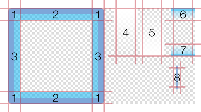
In addition, you can visually customize resizable picker wheels using frames from an image sheet. As indicated in the following image, this includes:
- An optional border overlay of eight frames constructed from
four corners (1) , upper/lowerhorizontal spans (2) , and left/rightvertical spans (3) . The span frames will be stretched to fill the space between the corner frames. - An optional
top fade span (4) andbottom fade span (5) . These will be stretched to the full width of the picker wheel. - Optional upper and lower frames
(6 and 7) which span across the vertical center to highlight the “selection” row. These will be stretched to the full width of the picker wheel. - Optional separator/divider (8) that will be automatically placed between the columns (underneath the border overlay and above the other elements).
sheet (required)
ImageSheet. The image sheet object for the picker wheel.
topLeftFrame (optional)
Number. The index number for the
topMiddleFrame (optional)
Number. The index number for the
topRightFrame (optional)
Number. The index number for the
middleLeftFrame (optional)
Number. The index number for the
middleRightFrame (optional)
Number. The index number for the
bottomLeftFrame (optional)
Number. The index number for the
bottomMiddleFrame (optional)
Number. The index number for the
bottomRightFrame (optional)
Number. The index number for the
topFadeFrame (optional)
Number. The index number for the top fade frame. This frame resides underneath the border/overlay and above the picker wheel columns. Its top edge aligns with the top of the picker wheel and it is stretched to span the defined width. This can be used to simulate a visual
bottomFadeFrame (optional)
Number. The index number for the bottom fade frame. This frame resides underneath the border/overlay and above the picker wheel columns. Its bottom edge aligns with the bottom of the picker wheel and it is stretched to span the defined width. This can be used to simulate a visual
middleSpanTopFrame (optional)
Number. The index number for the upper middle span frame. This frame resides underneath the border/overlay and above the picker wheel columns. Its top edge aligns with the top edge of the picker wheel’s center selection row and it is stretched to span the defined width. If desired, the vertical alignment can be adjusted via middleSpanOffset as noted below.
middleSpanBottomFrame (optional)
Number. The index number for the lower middle span frame. This frame resides underneath the border/overlay and above the picker wheel columns. Its bottom edge aligns with the bottom edge of the picker wheel’s center selection row and it is stretched to span the defined width. If desired, the vertical alignment can be adjusted via middleSpanOffset as noted below.
backgroundFrame (optional)
Number. The index number for the background frame that resides behind the picker wheel. This frame will be stretched to span the picker wheel’s defined width and constructed height.
separatorFrame (optional)
Number. The index number for the separator/divider frame. These separators will be automatically placed between the columns and they will be stretched to span the constructed height.
middleSpanOffset (optional)
Number. An offset value for both the upper and lower middle span frames. If positive, this value will offset middleSpanTopFrame upwards and middleSpanBottomFrame downwards from their default positions. This can be used to adjust the “spread” of the span frames in relation to the center selection row. Negative values are allowed.
borderPadding (optional)
Number. The number of pixels to pad the border/overlay on all sides. This can be used to expand the border frame beyond the picker wheel’s defined width and constructed height.
Fixed-Size Customization
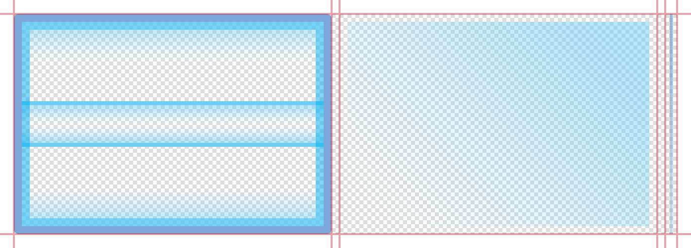
Fixed-size picker wheels can be visually customized using frames from an image sheet. As exhibited in the following image, this consists of three frames: an overlay (left), a background frame which resides behind the overlay (center), and an optional separator/divider (right) that will be automatically placed between the columns (underneath the overlay and above the background).
sheet (required)
ImageSheet. The image sheet object for the picker wheel.
overlayFrame (optional)
Number. The index number for the overlay edge/border frame.
backgroundFrame (optional)
Number. The index number for the background frame that resides behind the picker wheel.
separatorFrame (optional)
Number. The index number for the separator/divider frame. These separators will be automatically placed between the columns.
Fixed-size picker wheels are strictly 320×222 pixels in size (width×height). If you require a
custom-size picker wheel, please see Resizable Construction above.When implementing
fixed-size picker wheels, the total width of all columns should be 280 pixels, leaving a 20 pixel border on the left and right.
Examples
Default — Resizable
local widget = require( "widget" )

-- Set up the picker wheel columns
local columnData =
{
    {
        align = "left",
        width = 124,
        labelPadding = 20,
        startIndex = 2,
        labels = { "Hoodie", "Short Sleeve", "Long Sleeve", "Sweatshirt" }
    },
    {
        align = "left",
        width = 96,
        labelPadding = 10,
        startIndex = 1,
        labels = { "Dark Grey", "White", "Black", "Orange" }
    },
    {
        align = "left",
        width = 60,
        labelPadding = 10,
        startIndex = 3,
        labels = { "S", "M", "L", "XL", "XXL" }
    }
}

-- Create the widget
local pickerWheel = widget.newPickerWheel(
{
    x = display.contentCenterX,
    top = display.contentHeight - 160,
    columns = columnData,
    style = "resizable",
    width = 280,
    rowHeight = 32,
    fontSize = 14
})

-- Get the table of current values for all columns
-- This can be performed on a button tap, timer execution, or other event
local values = pickerWheel:getValues()

-- Get the value for each column in the wheel, by column index
local currentStyle = values[1].value
local currentColor = values[2].value
local currentSize = values[3].value

print( currentStyle, currentColor, currentSize )
Default — Fixed-Size
local widget = require( "widget" )

-- Set up the picker wheel columns
local columnData =
{
    {
        align = "left",
        width = 126,
        startIndex = 2,
        labels = { "Hoodie", "Short Sleeve", "Long Sleeve", "Sweatshirt" }
    },
    {
        align = "left",
        width = 106,
        labelPadding = 10,
        startIndex = 1,
        labels = { "Dark Grey", "White", "Black", "Orange" }
    },
    {
        align = "left",
        labelPadding = 10,
        startIndex = 3,
        labels = { "S", "M", "L", "XL", "XXL" }
    }
}

-- Create the widget
local pickerWheel = widget.newPickerWheel(
{
    x = display.contentCenterX,
    top = display.contentHeight - 222,
    fontSize = 18,
    columns = columnData
})

-- Get the table of current values for all columns
-- This can be performed on a button tap, timer execution, or other event
local values = pickerWheel:getValues()

-- Get the value for each column in the wheel, by column index
local currentStyle = values[1].value
local currentColor = values[2].value
local currentSize = values[3].value

print( currentStyle, currentColor, currentSize )
Image Sheet — Resizable
local widget = require( "widget" )

-- Set up the picker wheel columns
local columnData =
{
    {
        align = "left",
        width = 124,
        labelPadding = 20,
        startIndex = 2,
        labels = { "Hoodie", "Short Sleeve", "Long Sleeve", "Sweatshirt" }
    },
    {
        align = "left",
        width = 96,
        labelPadding = 10,
        startIndex = 1,
        labels = { "Dark Grey", "White", "Black", "Orange" }
    },
    {
        align = "left",
        width = 60,
        labelPadding = 10,
        startIndex = 3,
        labels = { "S", "M", "L", "XL", "XXL" }
    }
}

-- Image sheet options and declaration
local options = {
    frames =
    {
        { x=0, y=0, width=20, height=20 },
        { x=20, y=0, width=120, height=20 },
        { x=140, y=0, width=20, height=20 },
        { x=0, y=20, width=20, height=120 },
        { x=140, y=20, width=20, height=120 },
        { x=0, y=140, width=20, height=20 },
        { x=20, y=140, width=120, height=20 },
        { x=140, y=140, width=20, height=20 },
        { x=180, y=0, width=32, height=80 },
        { x=224, y=0, width=32, height=80 },
        { x=276, y=0, width=32, height=20 },
        { x=276, y=60, width=32, height=20 },
        { x=276, y=100, width=12, height=32 }
    },
    sheetContentWidth = 312,
    sheetContentHeight = 160
}
local pickerWheelSheet = graphics.newImageSheet( "widget-pickerwheel-resizable.png", options )

-- Create the widget
local pickerWheel = widget.newPickerWheel(
{
    x = display.contentCenterX,
    top = display.contentHeight - 176,
    columns = columnData,
    style = "resizable",
    width = 280,
    rowHeight = 32,
    fontSize = 14,
    sheet = pickerWheelSheet,
    topLeftFrame = 1,
    topMiddleFrame = 2,
    topRightFrame = 3,
    middleLeftFrame = 4,
    middleRightFrame = 5,
    bottomLeftFrame = 6,
    bottomMiddleFrame = 7,
    bottomRightFrame = 8,
    topFadeFrame = 9,
    bottomFadeFrame = 10,
    middleSpanTopFrame = 11,
    middleSpanBottomFrame = 12,
    separatorFrame = 13,
    middleSpanOffset = 4,
    borderPadding = 8
})

-- Get the table of current values for all columns
-- This can be performed on a button tap, timer execution, or other event
local values = pickerWheel:getValues()

-- Get the value for each column in the wheel, by column index
local currentStyle = values[1].value
local currentColor = values[2].value
local currentSize = values[3].value

print( currentStyle, currentColor, currentSize )
Image Sheet — Fixed-Size
local widget = require( "widget" )

-- Set up the picker wheel columns
local columnData =
{
    {
        align = "left",
        width = 126,
        startIndex = 2,
        labels = { "Hoodie", "Short Sleeve", "Long Sleeve", "Sweatshirt" }
    },
    {
        align = "left",
        width = 106,
        labelPadding = 10,
        startIndex = 1,
        labels = { "Dark Grey", "White", "Black", "Orange" }
    },
    {
        align = "left",
        labelPadding = 10,
        startIndex = 3,
        labels = { "S", "M", "L", "XL", "XXL" }
    }
}

-- Image sheet options and declaration
local options = {
    frames =
    {
        { x=0, y=0, width=320, height=222 },
        { x=328, y=0, width=320, height=222 },
        { x=656, y=0, width=12, height=222 }
    },
    sheetContentWidth = 668,
    sheetContentHeight = 222
}
local pickerWheelSheet = graphics.newImageSheet( "widget-pickerwheel-standard.png", options )

-- Create the widget
local pickerWheel = widget.newPickerWheel(
{
    x = display.contentCenterX,
    top = display.contentHeight - 222,
    columns = columnData,
    fontSize = 18,
    sheet = pickerWheelSheet,
    overlayFrame = 1,
    backgroundFrame = 2,
    separatorFrame = 3
})

-- Get the table of current values for all columns
-- This can be performed on a button tap, timer execution, or other event
local values = pickerWheel:getValues()

-- Get the value for each column in the wheel, by column index
local currentStyle = values[1].value
local currentColor = values[2].value
local currentSize = values[3].value

print( currentStyle, currentColor, currentSize )